
Friday, 9 November 2012
Changes
Due to the long processes that we would have had to go through to film at Audley end house we thought that we wouldn't have been able to film in time. So we have been through the village of Newport and discovered some great places to film, which we think will be a suitable place for filming.

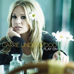
Researching Different fonts


This font is more jokey, it has a girly feel to it yet very plainly written.


These two fonts are Italic compared to the others, it gives the impression of the name being actually onto a piece of paper and adds to the realness and 3 dimensional effect.


Thursday, 8 November 2012
Equipment used for filming
In order to be able to film there are pieces of equipment that are essential for making our music video.


To be able to get still and precise footage for our music video we need a tripod. This is especially good for panning and tracking shots and generally helps out to prevent jumpy footage so will be very useful.
 This is a dolly. We will take one of these when filming so that moving shots are made easier for us. So instead of holding the camera and tripod we can just wheel the dolly around which makes our lives a lot easier.

The main piece of equipment is our HD cannon handheld video camera. We need to make sure this is fiully charged and we will have a backup battery just in case our original battery dies.


Digipak 3 Miley Cyrus- Can't be Tamed

In the front cover, the whole thing is very 'out there', very feisty with a lot of attitude.
The background is very plain with nothing but what seems like a spotlight which is on her, giving our full attention on Miley Cyrus. It is themed with very dark colours- khaki greens and black which gives us the impression that she isn't innocent, but in fact the complete opposite. Her costume is very revealing, all in leather which shows that she has hints of country in her because of the studs on the collar however it is very sharp yet fashionable at the same time. She is looking directly at the camera with a very fierce and serious expression on her face. This depicts a very confident woman in her, not afraid of much and has that personal connection with her fans. Lastly the font is very bold in capitals, in a khaki colour in the centre of the album cover. The font looks very rough, not hand drawn but looks like its been stamped on, almost like a prisoner. The 'can't be tamed' album name goes with the theme of being fierce. The way that her arm is positioned also draws attention to her bare tummy which gives her sex appeal.


The CD is very simple yet effective. It is like a collage of writing, and the writing all together says 'Miley Cyrus Can't Be Tamed'. Once again the font is very faded and rough and at the bottom in small print contains the legal jargon.

The inside picture is a similar photo to the front cover apart from the position of her hands is different. Her hands are on her collar holding her jacket which shows that she is somewhat fashionable and stylish. We see a shadow behind her which gives the idea of follwers, the fact she is famous reflects the fact she has loads of fans. She is once again in the centre third of the shot which automatically makes her centre of attention. Her hair is curly but has a degree of roughness to it, a messy look but still looking fashionable. She is pouting- this gives us the idea that she is comfortable with her looks and not camera shy.

Lastly is the inlay photo of Miley Cyrus. This shows her in a different light as she is more sexy in this particular photo as her pose outlines her curvy figure. Once again she is look straight at the camera so there is that personal relationship with her and her fans. She is more in the right of this shot which makes her less centre of attention. The fact that the spotlight is only on the top half of the body shows dignity, yet a hint of sex appeal as we have sneak peaks of her skin- for example her shoulder and parts of her chest through her dress. The pearls around her neck have a more original and traditional feel to the picture and her hair is curly and long. She looks more elegant and its almost the other side to her, her more sensible side.
Kylie Minogue- Flower Micro Element
Another micro element which i would very much like to incorporate in our music video is a cross dissolve. This gives a soft touch onto the video, and i would particularly like to use it when the girl in the video will be walking so we can track her feet from A to B but give another touch to it. In this video 'Flower' by Kylie minogue, the cross dissolve is used whilst she is lip syncing so that it gives the impression of some time passing possibly. It looks effective and adds to the authenticity as it is also in black and white which is another element which i could consider using.


In this screen shot you can clearly see the cross dissolve transition used. I have also looked this up on youtube and found a really helpful tutorial on how to add in cross dissolves like this one that was used in the video.
Selena Gomez- Who says Micro Elements

The first element in the video is the mis en scene. I like how she wears a black dress, so not conforming to the stereotypical 'girly' theme of colours. This supports the theorist Levi- Strauss as he says that there are BINARY OPPOSITIONS. The binary opposition in this case is being Perfect and not being perfect. This particularly fits with the song as it is about how she doesn't care about being 'perfect' and she is just herself.

Another element that i liked was the use of the split screen. It is very effective as it may either help to understand the narrative of the song and to tell a story, or even use it as a contrast of scenes or show different people. In this print screen that i took, it gives a clearer picture of the surroundings.
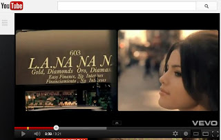 The last element that i found extremely effective was the use of the images whilst Selena sung them. For example when she sung 'nanananana' The split screen has a shot of her in one and a shop called 'nana'. There are other words in that shot of the shop as she mentions 'a diamond in the ruck' it has relevance to the shop as it is a jewellery shop. And this is also used again just after when she sings 'you've got every right' it cuts to a shot of two sign posts- one pointing left saying 'every' and one pointing right saying 'right' which is portraying the lyrics through images.
Here is the tutorial i have found about how to make a basic split screen so as long as i follow the instructions it should be a fairly simple process.
 The last element that i found extremely effective was the use of the images whilst Selena sung them. For example when she sung 'nanananana' The split screen has a shot of her in one and a shop called 'nana'. There are other words in that shot of the shop as she mentions 'a diamond in the ruck' it has relevance to the shop as it is a jewellery shop. And this is also used again just after when she sings 'you've got every right' it cuts to a shot of two sign posts- one pointing left saying 'every' and one pointing right saying 'right' which is portraying the lyrics through images.
Here is the tutorial i have found about how to make a basic split screen so as long as i follow the instructions it should be a fairly simple process.
Subscribe to:
Posts (Atom)