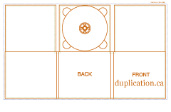
We have decided to go for an original Digipak template. We are in the process of making our digipak, using photoshop which is a challenge as Photoshop isn't a program i would normally use. We have found very useful tutorials on youtube.
Showing posts with label analysis of digipak. Show all posts
Thursday, 29 November 2012
Thursday, 8 November 2012
Digipak 3 Miley Cyrus- Can't be Tamed
The front cover to Miley Cyrus' Digipak can't be tamed is a much more grown up, girl compared to what she was like before.
In the front cover, the whole thing is very 'out there', very feisty with a lot of attitude.
The background is very plain with nothing but what seems like a spotlight which is on her, giving our full attention on Miley Cyrus. It is themed with very dark colours- khaki greens and black which gives us the impression that she isn't innocent, but in fact the complete opposite. Her costume is very revealing, all in leather which shows that she has hints of country in her because of the studs on the collar however it is very sharp yet fashionable at the same time. She is looking directly at the camera with a very fierce and serious expression on her face. This depicts a very confident woman in her, not afraid of much and has that personal connection with her fans. Lastly the font is very bold in capitals, in a khaki colour in the centre of the album cover. The font looks very rough, not hand drawn but looks like its been stamped on, almost like a prisoner. The 'can't be tamed' album name goes with the theme of being fierce. The way that her arm is positioned also draws attention to her bare tummy which gives her sex appeal.
The back is very bold. The font looks like its been washed away which gives it an older, more traditional look to it, especially as it is in black and white- matching the dark colour theme. There are no spaces, the font is so bold that they names of the songs literally scream out the page. It also contains the legal jargon- the bar code, the name of the production and record company. It includes special features that can be viewed on your computer or laptop which is even more appealing to the buyer.
The CD is very simple yet effective. It is like a collage of writing, and the writing all together says 'Miley Cyrus Can't Be Tamed'. Once again the font is very faded and rough and at the bottom in small print contains the legal jargon.

The inside picture is a similar photo to the front cover apart from the position of her hands is different. Her hands are on her collar holding her jacket which shows that she is somewhat fashionable and stylish. We see a shadow behind her which gives the idea of follwers, the fact she is famous reflects the fact she has loads of fans. She is once again in the centre third of the shot which automatically makes her centre of attention. Her hair is curly but has a degree of roughness to it, a messy look but still looking fashionable. She is pouting- this gives us the idea that she is comfortable with her looks and not camera shy.
Lastly is the inlay photo of Miley Cyrus. This shows her in a different light as she is more sexy in this particular photo as her pose outlines her curvy figure. Once again she is look straight at the camera so there is that personal relationship with her and her fans. She is more in the right of this shot which makes her less centre of attention. The fact that the spotlight is only on the top half of the body shows dignity, yet a hint of sex appeal as we have sneak peaks of her skin- for example her shoulder and parts of her chest through her dress. The pearls around her neck have a more original and traditional feel to the picture and her hair is curly and long. She looks more elegant and its almost the other side to her, her more sensible side.
In the front cover, the whole thing is very 'out there', very feisty with a lot of attitude.
The background is very plain with nothing but what seems like a spotlight which is on her, giving our full attention on Miley Cyrus. It is themed with very dark colours- khaki greens and black which gives us the impression that she isn't innocent, but in fact the complete opposite. Her costume is very revealing, all in leather which shows that she has hints of country in her because of the studs on the collar however it is very sharp yet fashionable at the same time. She is looking directly at the camera with a very fierce and serious expression on her face. This depicts a very confident woman in her, not afraid of much and has that personal connection with her fans. Lastly the font is very bold in capitals, in a khaki colour in the centre of the album cover. The font looks very rough, not hand drawn but looks like its been stamped on, almost like a prisoner. The 'can't be tamed' album name goes with the theme of being fierce. The way that her arm is positioned also draws attention to her bare tummy which gives her sex appeal.
The back is very bold. The font looks like its been washed away which gives it an older, more traditional look to it, especially as it is in black and white- matching the dark colour theme. There are no spaces, the font is so bold that they names of the songs literally scream out the page. It also contains the legal jargon- the bar code, the name of the production and record company. It includes special features that can be viewed on your computer or laptop which is even more appealing to the buyer.
The CD is very simple yet effective. It is like a collage of writing, and the writing all together says 'Miley Cyrus Can't Be Tamed'. Once again the font is very faded and rough and at the bottom in small print contains the legal jargon.

The inside picture is a similar photo to the front cover apart from the position of her hands is different. Her hands are on her collar holding her jacket which shows that she is somewhat fashionable and stylish. We see a shadow behind her which gives the idea of follwers, the fact she is famous reflects the fact she has loads of fans. She is once again in the centre third of the shot which automatically makes her centre of attention. Her hair is curly but has a degree of roughness to it, a messy look but still looking fashionable. She is pouting- this gives us the idea that she is comfortable with her looks and not camera shy.
Lastly is the inlay photo of Miley Cyrus. This shows her in a different light as she is more sexy in this particular photo as her pose outlines her curvy figure. Once again she is look straight at the camera so there is that personal relationship with her and her fans. She is more in the right of this shot which makes her less centre of attention. The fact that the spotlight is only on the top half of the body shows dignity, yet a hint of sex appeal as we have sneak peaks of her skin- for example her shoulder and parts of her chest through her dress. The pearls around her neck have a more original and traditional feel to the picture and her hair is curly and long. She looks more elegant and its almost the other side to her, her more sensible side.
Thursday, 25 October 2012
Digipak 2- Analyis of Dolly Parton
One of the digipak's i have decided to analyse is of Dolly Parton's album called 'Halos and Horns'.
Here on the right is the front cover of the cd digipak. This conforms to the country genre in many ways as the photo is natural and Dolly Parton is laying on the grass-outside which is the main convention of this particular genre. I have also decided that it is a natural pose as she has a few of her front teeth showing. This gives the audience an idea that the artists in this genre have a strong sense of freedom and are very liberated people. The style of the text is very plain yet bold and eye catching as the text is edited so that it is transparent and doesn't completely distract us from Dolly laying on the grass. Her costume is very 'western' and typical of a 'country' artist as they consistently wear denim. This shows us that it isn't all about what she looks like but how comfortable she is on the camera as someone wearing casual clothes.
The back cover is the only part of the whole digipak that is completely different. This may show the buyer that she takes her music seriously, however jokey and fun she is portrayed as.The photo of her with a serious face reflects the effort she puts into playing music. It is in black and white which gives a very plain look to the image-very minimalistic. The text is in capital letter like her name and album name in the front cover so still follows that same sort of pattern. It says that it has been 'produced by dolly parton' which automatically tells us of how talented she is and how she isn't fake, all her music has come from her. There is the legal jargon- so the bar code is included and the production company.
Here is her disc.
This CD looks almost like a painting. When zoomed in, the disc looks like a canvas which It only shows clouds within the picture which gives us the impression that the artist can be 'stuck in the clouds' which would reflect the moods that they are in. It also shows how reflective they are and how they have very strong thoughts. This is very plain and doesn't have a photo of Dolly on it so it is kept minimal which we could consider doing on our own digipaks. It matches the white text that is also kept within the chosen colour schemes which are natural colours- blue like the sky, green like the grass etc. It includes the legal jargon about how it is digital and the production company is Sanctuary Record Group. The background in this CD may also be what Dolly Parton is looking at in her front cover.


This photo is in the Inlay of the digipak.It is similar of the one in her front cover but a more zoomed out photo of her. Much like the front cover, she is laying on the grass looking very thoughtful with a subtle smile on her face which makes us think of how content she is when shes out in the countryside. The photo isn't completely straight which adds to the whole natural atmosphere.Once again she is wearing denim which conforms to the typical conventions of Country.

This photo is very natural, she seems to be shouting out with a grin on her face- this happy emotion will reflect onto the buyer of this CD and will convey positive vibes. Although this is a 'jokey' photo there is still a little sex appeal as we see some cleavage showing. Her jacket is again conforming to the country stereotype genre however the glitzy sequins on the collar and around the edges of the jacket show a subtle integration on the Pop genre as she is seen to be more girly in this picture. There are traditional parts to this photo as it is still about the music with the guitar in her hand and she is, what looks like, on a country road out in the open.
Subscribe to:
Posts (Atom)


