Monday, 10 December 2012

Unused photos

These photos that i have uploaded are rejected photos that we considered using as possible advert/ digipak photos. 


With this first photo, we decided against using it because the image as wasn't the correct size, it was too big length wise even after editing it on photoshop so that it would be an appropriate size for a professionally edited digipak. Also this photo was edited too dark and i was unable revert the image back to the original one. 


With this image i played around with the effects quite a lot. I thought that in order for her to be centre of attention then a good way of emphasising this was to blur the background out and as a result didn't look as good as i wanted it to be, also because the tutu she wears is very feminine so would be a suitable costume for her to wear. I also wanted to add a personal touch to it by adding the same font as we used for the front and back cover to make it all match professionally with part of the colour theme of pink. 


This was our original front cover. 

We thought by making the photo black and white and her in colour it would be a decent way of challenging the typical pop convention. However after careful thought we decided against this as it looked almost too fake and unrealistic that we just weren't happy with it. Also it was fairly difficult to make our particular font that we wanted, show up well in front of the black and white background, so we were having trouble with that too and had to make sure that we had to have an 'inner glow' a 'drop shadow' and an 'outer glow' to make sure that it stood as much as we could make it. Here is a print screen of how i had to make the text in the layer on photoshop as bold as i could. 


This photo we considered using but by using this we thought that we would have used outdoor scenery of trees etc a little too much as we have used both photos of our artist and of just the scenery so to have the majority of inlays as scenery wouldn't be appealing to the 
buyer of the album. 


This photo that we also took onset was unsuitable as a digipak photo as the artists was a bit off guard when we actually took the photo so her mouth appears to be open and her eyes shut. However the angling of the camera makes the shot look nice,not only because of the angle but because of the fact she is on the far right which looks appropriate because of the rule of thirds, she is not directly in centre but she is important enough in the shot to actually acknowledge. 


                                                                                             This last photo is very nice as we very much liked how the trees all caved in together- this photo is very clever indeed however the lighting wasn't very good as it was too bright and however much we edited it and tried to tone it down by hue, saturation, curves etc it just didn't work so we had to make so with this end result on the editing. It doesn't look totally awful but the use of the pinks yet again would be overusing the pinks and purples as much as they look good in the edited photo.  
                                                                                          

Friday, 7 December 2012

Adverts

As well as making a Digipak, we have to make an Advert too. I have done some research and i have found a number of Adverts that are useful to analyse to get an idea of how to set our Advert out.
With this Gwen Stefani advert it is very bold. Italmost looks like the photo has been edited to look like she isnt real, and that she is animated by what looks like a watercolour effect. She is central so all of our attention will immediately be brought onto her. The crown and the other props thathave been added in are all sparkly which depicts a flashy woman, that she is very successful in what she does and how she can afford to spend money. The crown shows that she is viewed as a 'queen' of her kind of genre. The colours are very vibrant, and all the colours almost merge into eachother,especially the greens and oranges, and match extremelywell with the colour of the font. The font is very old english, very traditional which goes with the jewels to add to the royal look. In the corner there is a photo of the front cover of her digipak to advertise that too to encourage eople to buy it. The photos are very similar and the advert photo looks like a zoomed in picture which personally makes me want to see the whole thing. It includes information about when her album is due out and what songs are on there -rich girl is a very popular song so people would recognise that and encourage them to buy the rest of the album. Included on this is somewhere to purchase the album so it is quick and easy to buy.
Taylor Swifts advert has a very different portrayal to Gwen Stefani's. She looks very innocent yet her eye contact with the camera adds a bit of sex appeal as she is looking from the corner of her eyes.Again though she is central in the advert which draws us automatically to Taylor Swift's face. The colour theme is very minimal only using yellow, red and white which matches with the photo.The font looks like it has been hand written which gives Taylor swift a personal touch to her advert, and her name looks like it has been written so could possibly be her signature and uses it to be known for this. It says where the album is available to buy so it is easily accessible for their audiences to buy it. Much like Gwen Stefani's advert it shows the front cover of the album and from what we can she see looks very glamourous in what seems to be a red dress. It has added extras written in bold near the bottom to appeal to the public even more. The QR code in the bottom right hand corner may take the audience member onto her website which is also useful. 

This advert by Jessi J is very in your face, it is very centre of attention and gives a lot of attitude with her mouth open. All of the colours work well together as her make up which is smokey and dark matches with the grey bold and capitals font that stands out. Jessi J's name is in an italic font in a silver colour, i don't think that her name stands out as much as it is a fainter colour however as jessie j is very well known for her chart songs, her name doesn't need to be very bold and stand out. Her songs that are mentioned from her new album are very successful already and especially featuring people like david guetta will definitely expand her audience and even just her name. She has an official website which is useful for her fans to look at directly for tour dates etc and for more info about her. The way she looks at the camera is very daunting which emphasises her confidence and her attitude, as, if she can play up to a camera for a photo shoot then you can imagine what she would be like live. 


Thursday, 29 November 2012

Our digipak layout

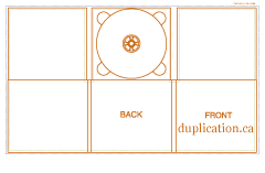
We have decided to go for an original Digipak template. We are in the process of making our digipak, using photoshop which is a challenge as Photoshop isn't a program i would normally use. We have found very useful tutorials on youtube.


Thursday, 22 November 2012

Progress post- Editing day

Today we had a full day of editing. This was extremely useful for Tash and I as we had only made a start to our editing beforehand, so it gave us a day of actually piecing all of our footage together to make us closer to finishing our final piece. We looked up tutorials on how to split screen, and we managed to use different transitions such as cross dissolves and additive dissolves. These transitions helped to make our piece look very authentic and different to the normal dissolves. We managed to get about 3/4 done on the editing day so we made a massive progression from a few clips on final cut express to the majority of the footage edited and placed into final cut in order to finish the video. 

Thursday, 15 November 2012

Progress post

We have now finished our filming and in our Media lesson today we uploaded our footage from the camera onto our chosen mac then began to edit our footage. So we had quite a productive lesson overall. 

Tuesday, 13 November 2012

Progress Post

Today, on the 13/11/12 we managed to do the first part of filming with our friend who also attends sixth form called Abigail Sears. She was kind enough to star in the music video. We have yet to just film some shots of Abi with a boy to add to the narrative of our piece. 

Saturday, 10 November 2012

Risk assessment

During our time filming, we have to take into consideration the risks that we may be faced with.

* Whilst getting to our chosen setting, we come across a train crossing. 
-We should make sure to walk over the crossing, sensibly and when is best to do so.

* walking through the river with bare feet can cut her feet as there may be sharp objects that we cannot see. 
-Make sure to walk through the river carefully, finding a safe path in order to be able to film.

*Whilst filming on the bridge we have the risk of falling beneath or through the barriers at the sides, and risk of equipment falling in river.
- We need to use a tripod to keep the camera secure and still and stand as far in the centre as possible to be able to avoid falling over the barriers. 

*Risk of actress/actor falling or tripping over whilst filming.
- Make sure all equipment and bags etc are clearly out of the way and look to see if there is any uneven ground which would be unsuitable place for using as a running shot.

* Risk of getting scratched/ poked in the eye by branches or stinging nettles.
- This can be easily avoidable as we just choose not to film in unnecessary places which will cause harm to our actor and actress.